Pop Perfect
Microwave Popcorn
|
|
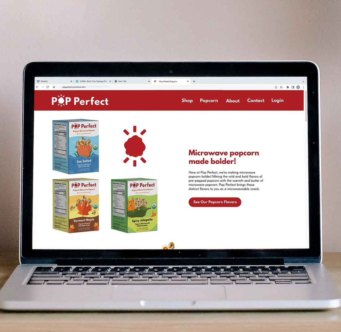
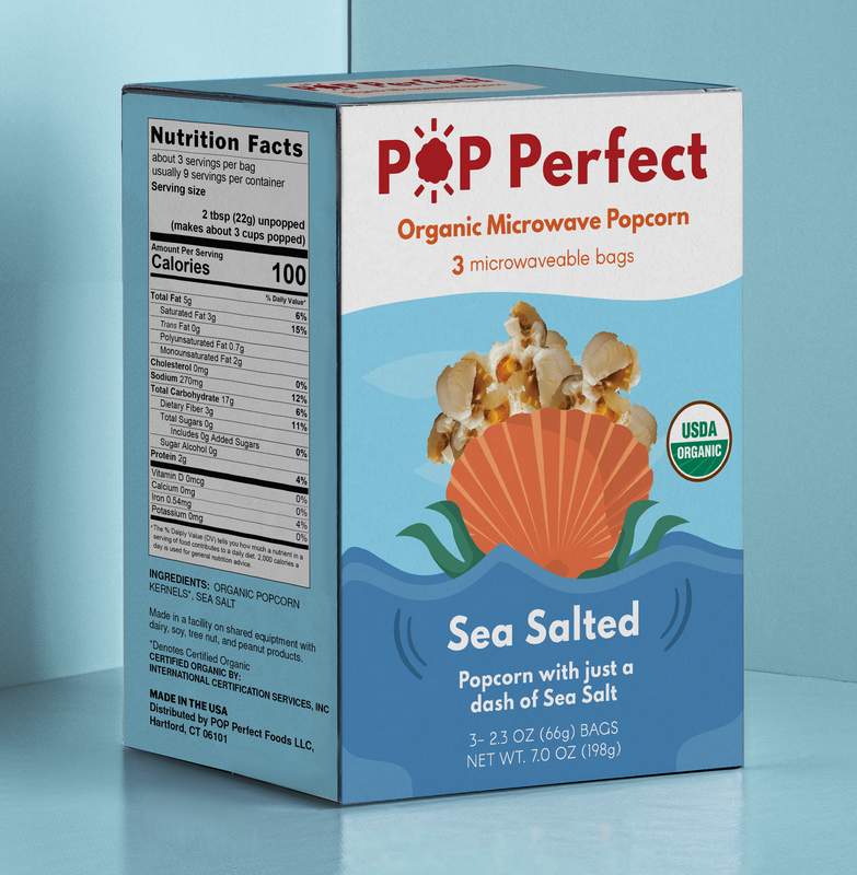
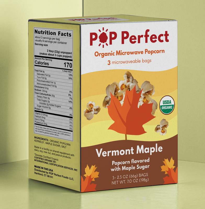
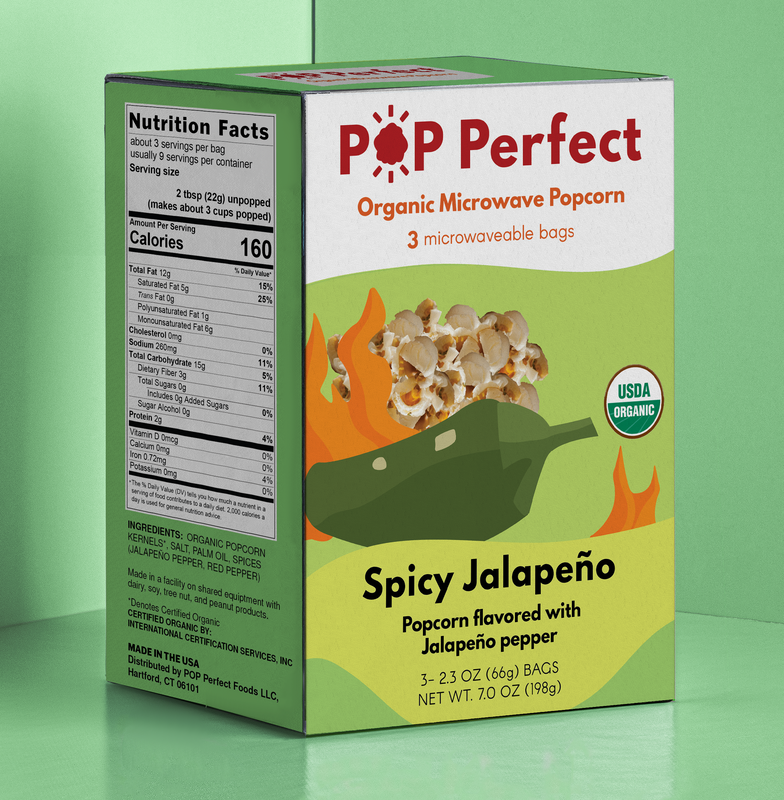
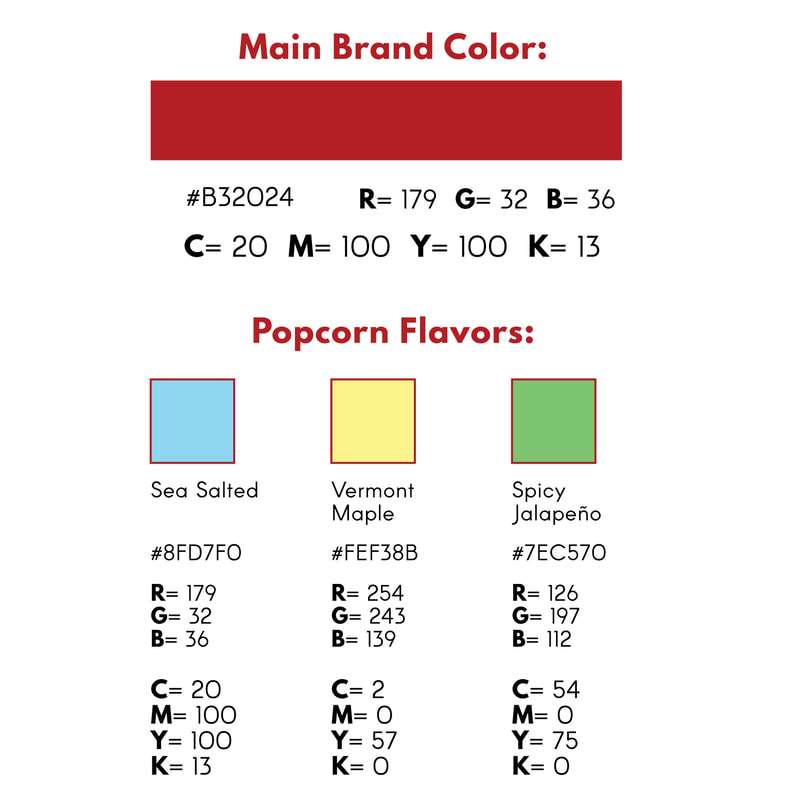
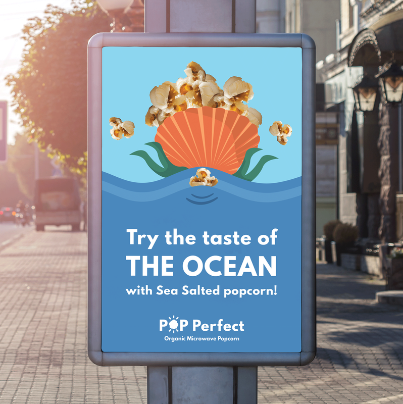
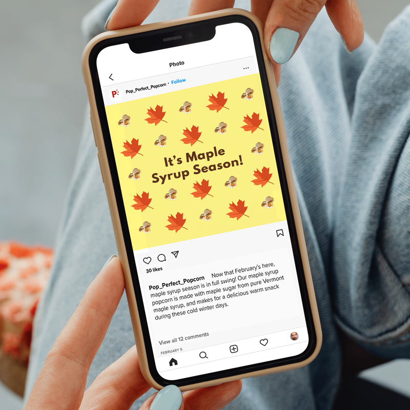
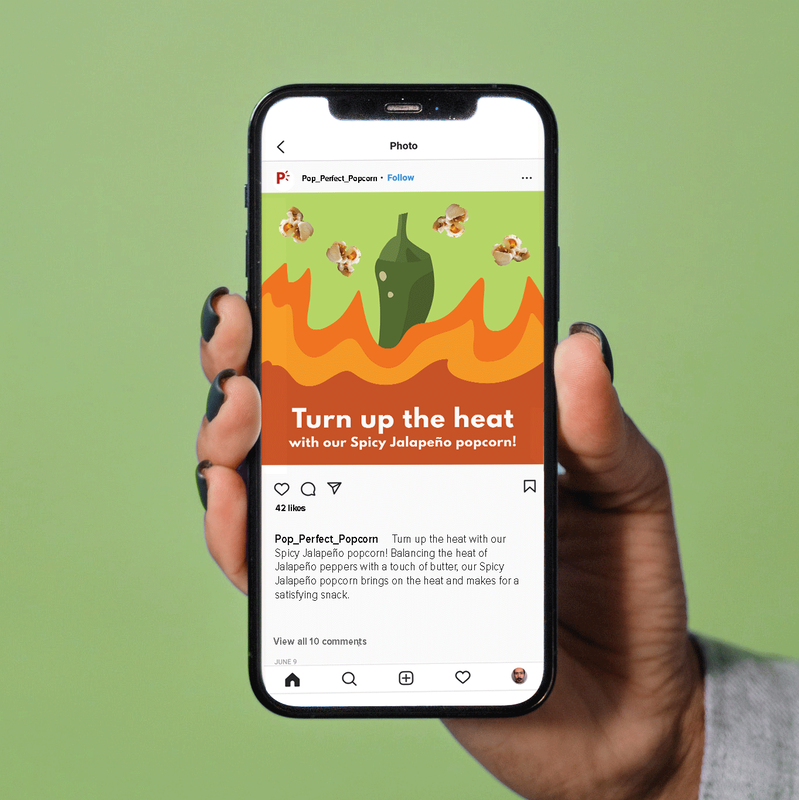
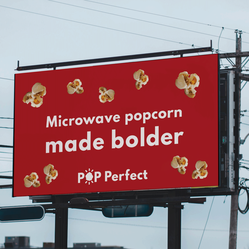
The Client: Pop Perfect is a conceptual brand of microwave popcorn: featuring bold flavors such as Sea Salted, Vermont Maple, and Spicy Jalapeño Popcorn, Pop Perfect brings the exciting flavors typically found in pre-popped popcorn into the microwave popcorn category.
The Problem: With their bold and flavorful varieties of microwave popcorn, Pop Perfect needed a visual branding system that clearly expressed their essence as a brand: specifically, they needed branding that conveyed the excitement and bold flavors that they bring to the microwave popcorn category. Pop Perfect needed visual branding that would extend to their popcorn packaging, branding materials, and marketing assets, that would effectively distinguish them among other microwave popcorn brands.
The Solution: To solve these problems, I created a visual branding guide for the Pop Perfect brand: I then applied these branding elements in creating their microwave popcorn packaging, as well as other branding and marketing assets for the Pop Perfect brand.
|
|
|
|