Garden Goods Spices
PACKAGE DESIGN AND BRANDING
The Client: Cooking healthy meals on limited budgets has become a priority for today's families- as an organic cooking spice brand, Garden Goods seeks to fulfill this need with their high-quality yet affordable variety of cooking spices.
The Problem: Garden Goods needed visual branding system that expressed their characteristics as a brand: as a modern, family-friendly, and approachable brand with affordable yet high-quality products, Garden Goods needed a clear way to visually express these attributes while visually differentiating themselves in the spice aisle.
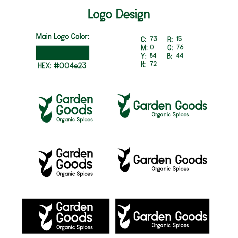
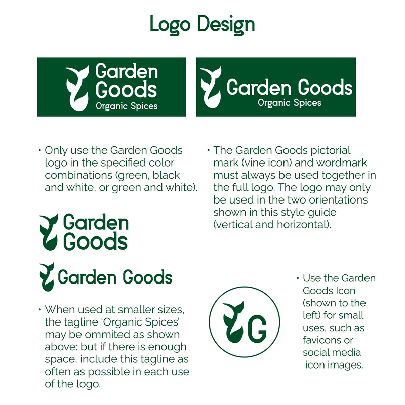
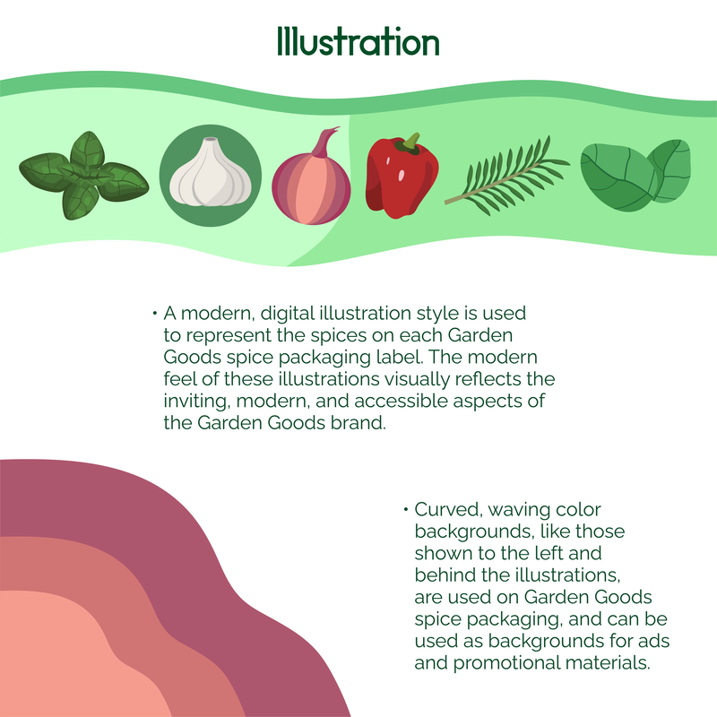
The Solution: To meet this need, I created a full visual brand style guide for Garden Goods Spices, outlining the brand's logo, logo variations, typography, illustrations, color palette, and photo usage. Once this was complete, I extended these visual elements onto Garden Goods' spice jar labels, as well as digital and print ads for the brand.
The Problem: Garden Goods needed visual branding system that expressed their characteristics as a brand: as a modern, family-friendly, and approachable brand with affordable yet high-quality products, Garden Goods needed a clear way to visually express these attributes while visually differentiating themselves in the spice aisle.
The Solution: To meet this need, I created a full visual brand style guide for Garden Goods Spices, outlining the brand's logo, logo variations, typography, illustrations, color palette, and photo usage. Once this was complete, I extended these visual elements onto Garden Goods' spice jar labels, as well as digital and print ads for the brand.
Brand Style Guide:
|
|
|
|
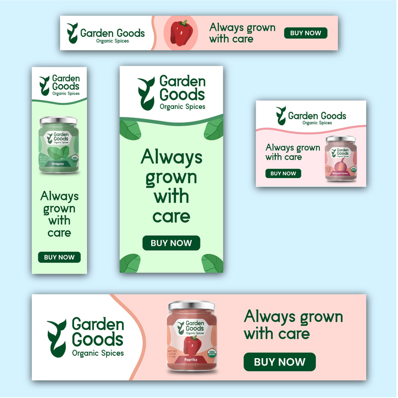
Garden Goods Ads:
|
|
|
|
|
Logo Design Process:
To begin the process of shaping the conceptual Garden Goods brand, I outlined the brand's core qualities and attributes: as a brand, its products are organic but affordable, healthy, and family-friendly. Overall, the feeling of the Garden Goods brand was outlined to be friendly and approachable: with the brand positioning determined, I then created thumbnail sketches of early logo concepts.
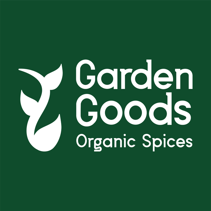
After sketching a number of these logo concepts, three of these were selected to be refined into more highly-detailed drafts. Ultimately, out of these three refined drafts, I selected the Garden Goods word mark paired with the vine pictorial mark as the logo concept for Garden Goods: the vine icon visually references the organic quality of their spices, while being recognizable even when scaled down to small sizes.
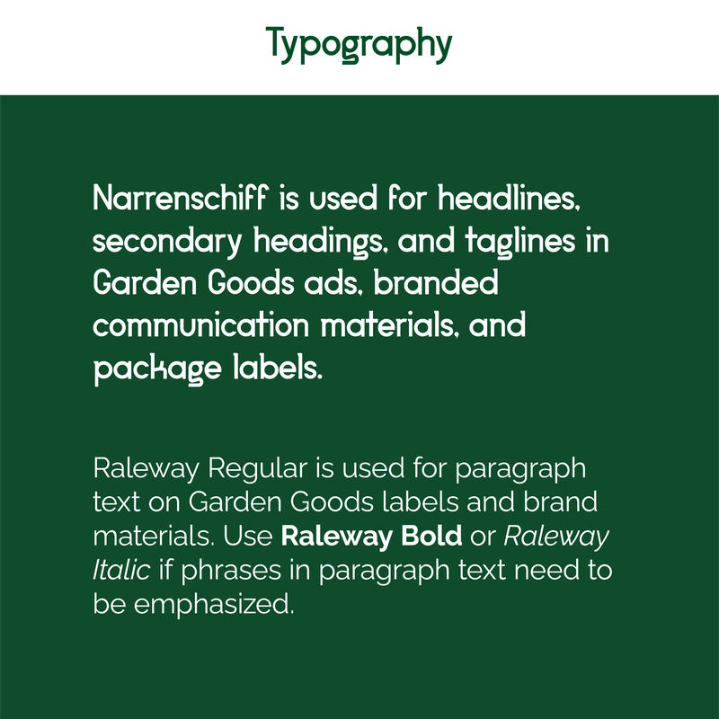
Additionally, the typeface Narrenschiff was chosen for Garden Goods' branding: its rounded curves and large counters give it a playful and organic aspect, and it conveys a clearly modern feel as a geometric sans-serif typeface.
After sketching a number of these logo concepts, three of these were selected to be refined into more highly-detailed drafts. Ultimately, out of these three refined drafts, I selected the Garden Goods word mark paired with the vine pictorial mark as the logo concept for Garden Goods: the vine icon visually references the organic quality of their spices, while being recognizable even when scaled down to small sizes.
Additionally, the typeface Narrenschiff was chosen for Garden Goods' branding: its rounded curves and large counters give it a playful and organic aspect, and it conveys a clearly modern feel as a geometric sans-serif typeface.